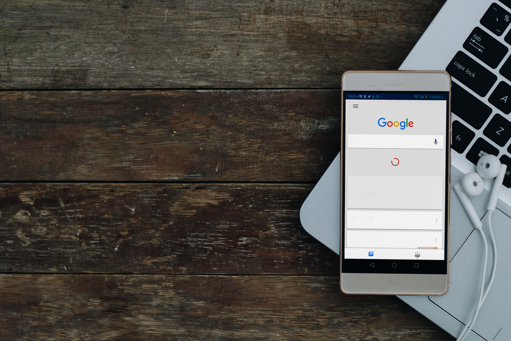
New Search Interface Launched by Google for Tablet Users
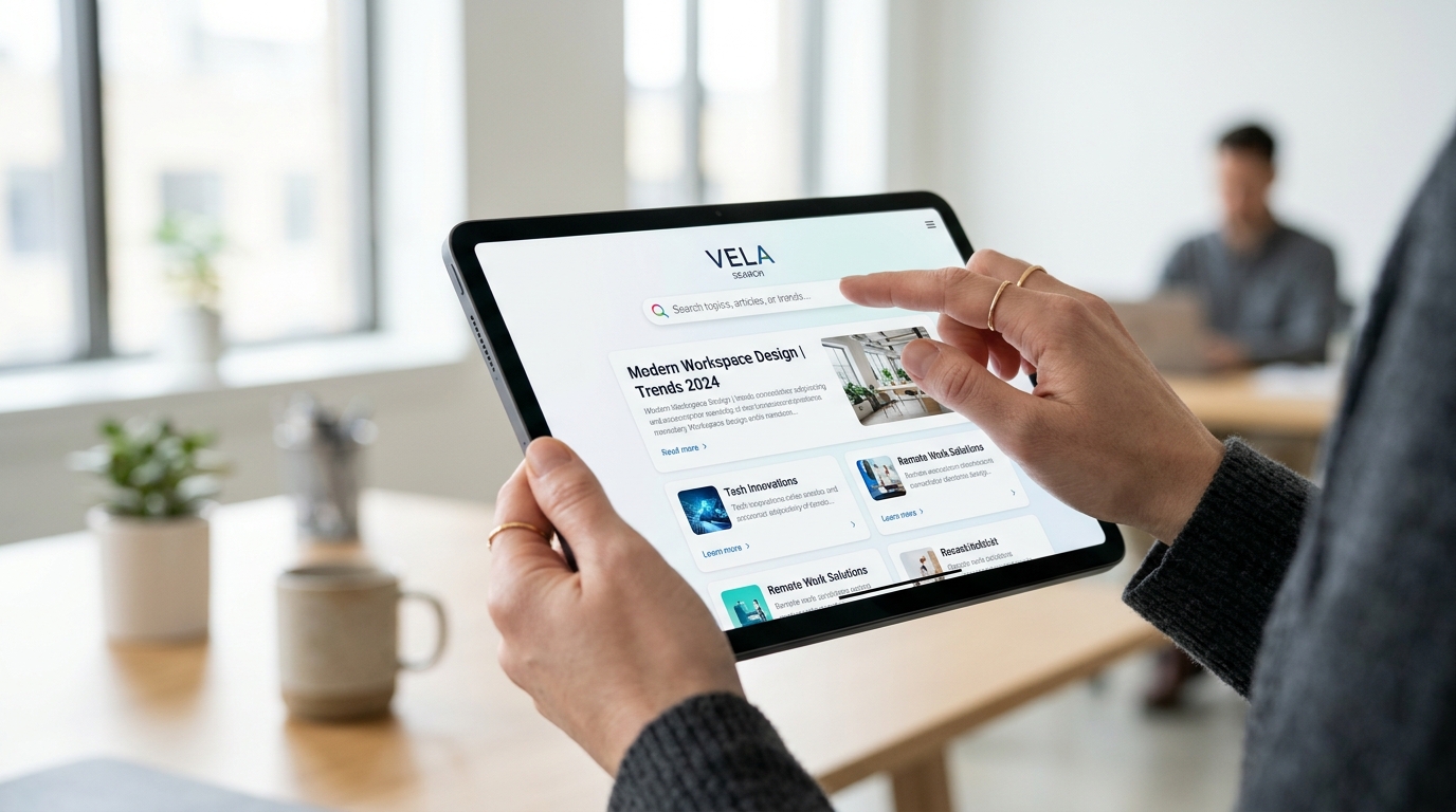
Google has redesigned its search results layout specifically for tablet computers, replacing the legacy desktop hybrid view with an intuitive, touch-optimized card interface.
The Unique Ergonomics of Tablet Computing
For years, tablets occupied an awkward middle ground in web design. Many websites served full desktop views that felt clumsy to touch, while others served cramped mobile smartphone layouts that wasted expansive screen real estate.
Recognizing the distinct usage patterns of tablet users, Google deployed a dedicated search interface tailored specifically for 7-to-11-inch touchscreen devices.
Key Features of the Redesigned Interface
- Card-Based Result Containers: Search results are housed in distinct, card-styled containers that provide generous finger-tap areas without mis-clicks.
- Touch-Optimized Horizontal Carousels: Image galleries, local business listings, and related searches can be swiped horizontally with fluid gesture response.
- Expanded Knowledge Graph Panels: Side-by-side informational panels leverage tablet landscape width to present answers and business details without full-page reloads.
- Cleaner Spacing & Legible Typography: Margins and line heights are optimized for comfortable reading at arm's length on couch or desk settings.
Lessons for Responsive Web Design
Audit your website specifically on tablet devices in both portrait and landscape orientations. Ensure interactive dropdowns, sliders, and buttons respond gracefully to touch gestures without requiring precision mouse hovering.